With thousands of hits every day, Lobster Ink is currently the leading e-learning organization in the hospitality industry. The company is responsible for training the staff from the biggest hotel chains in the world, such as Marriott Hotels, Hilton Hotels, and Kempinski.
Lobster Ink is scaling fast, and the Learning Management System (LMS) is expanding as fast as the company. Visual and development problems are the natural consequences of a high growth organization that has no design guidance and standardized processes. Duplicated components, inconsistency between elements, and development getting slower every day became a regular problem. As well as no source of truth for countless issues.
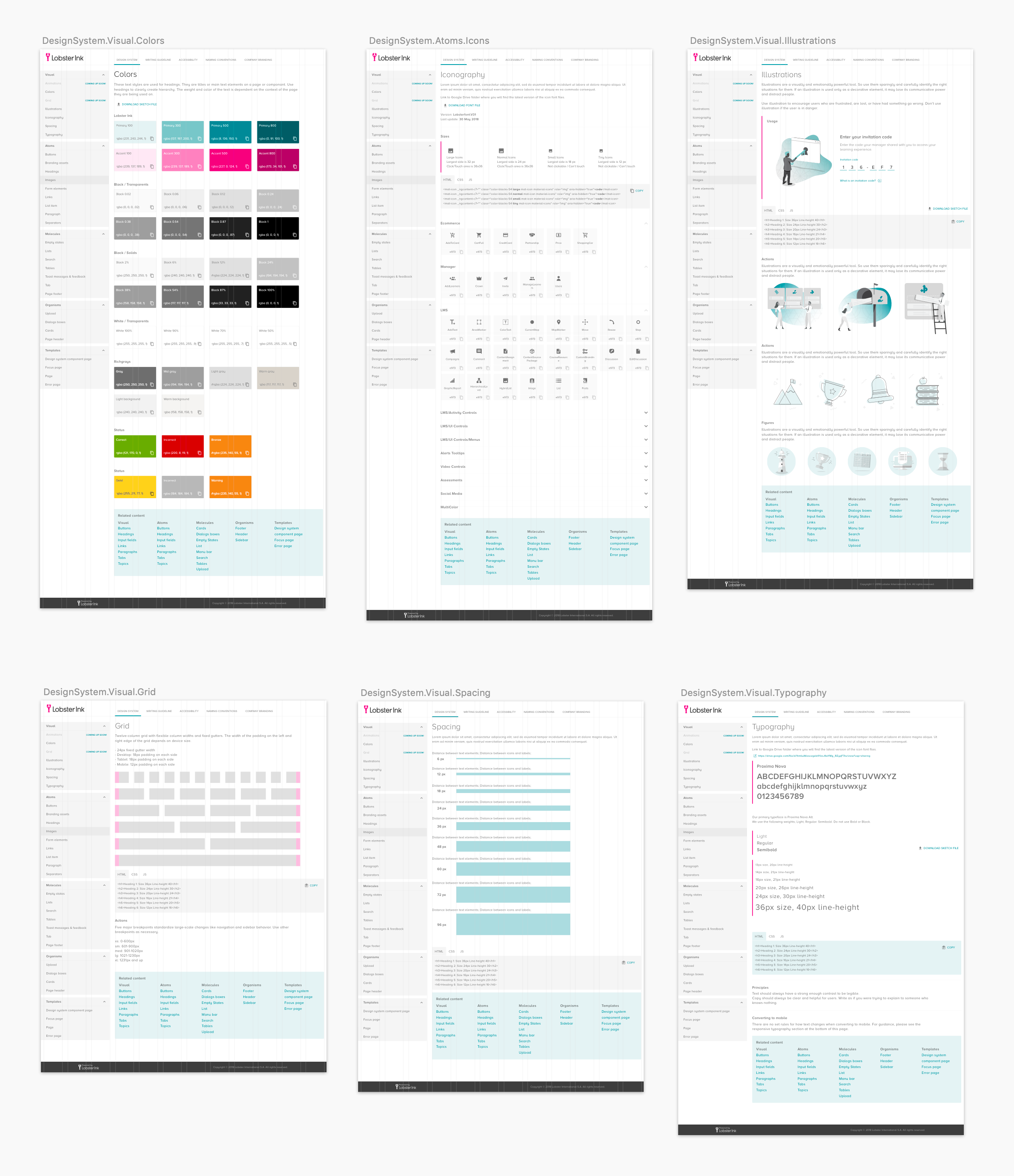
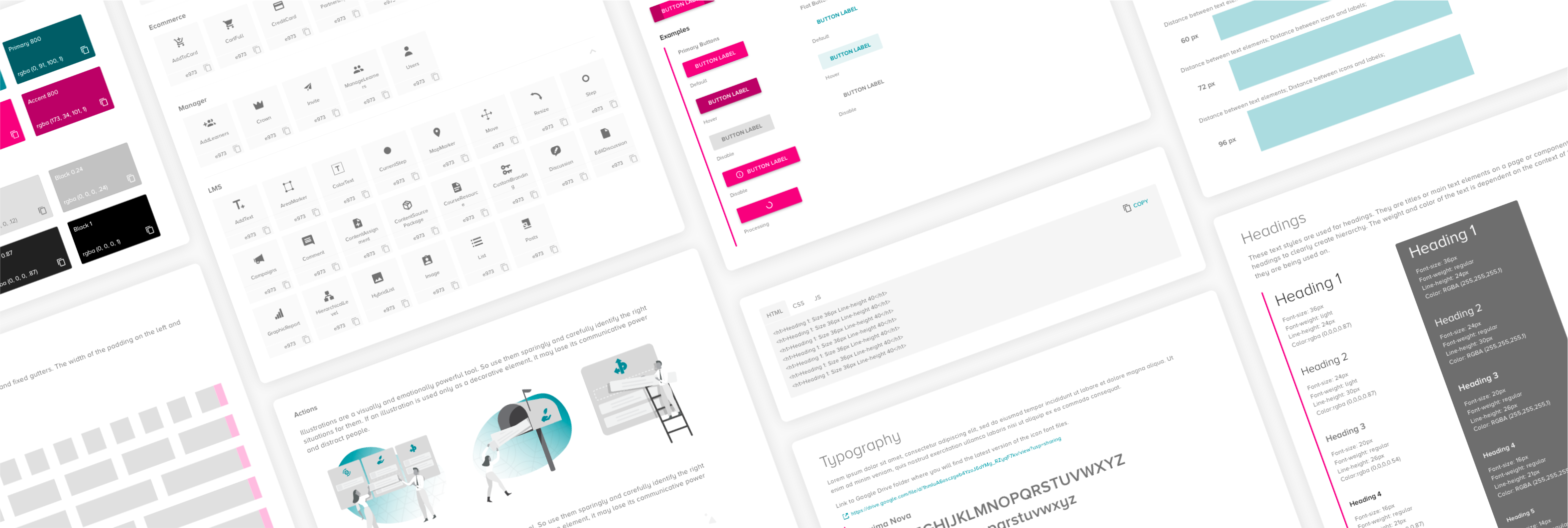
Observing this disordered situation, I proposed creating a design system to help us. This tool could be useful for things like supporting the QA team on its approvals, guiding developers and designers to reuse components, and accelerating project development without losing consistency.
To get the project started, I got together with the main stakeholders, QAs, developers, and designers to discuss pains in their routines and the possible benefits they see in having a design system. The Head of Design, the Product Owner and I set up a team and the ownership of the project. The team composition consisted of a front-end developer, the Product Owner herself, and I as UX Designer and Project Lead.
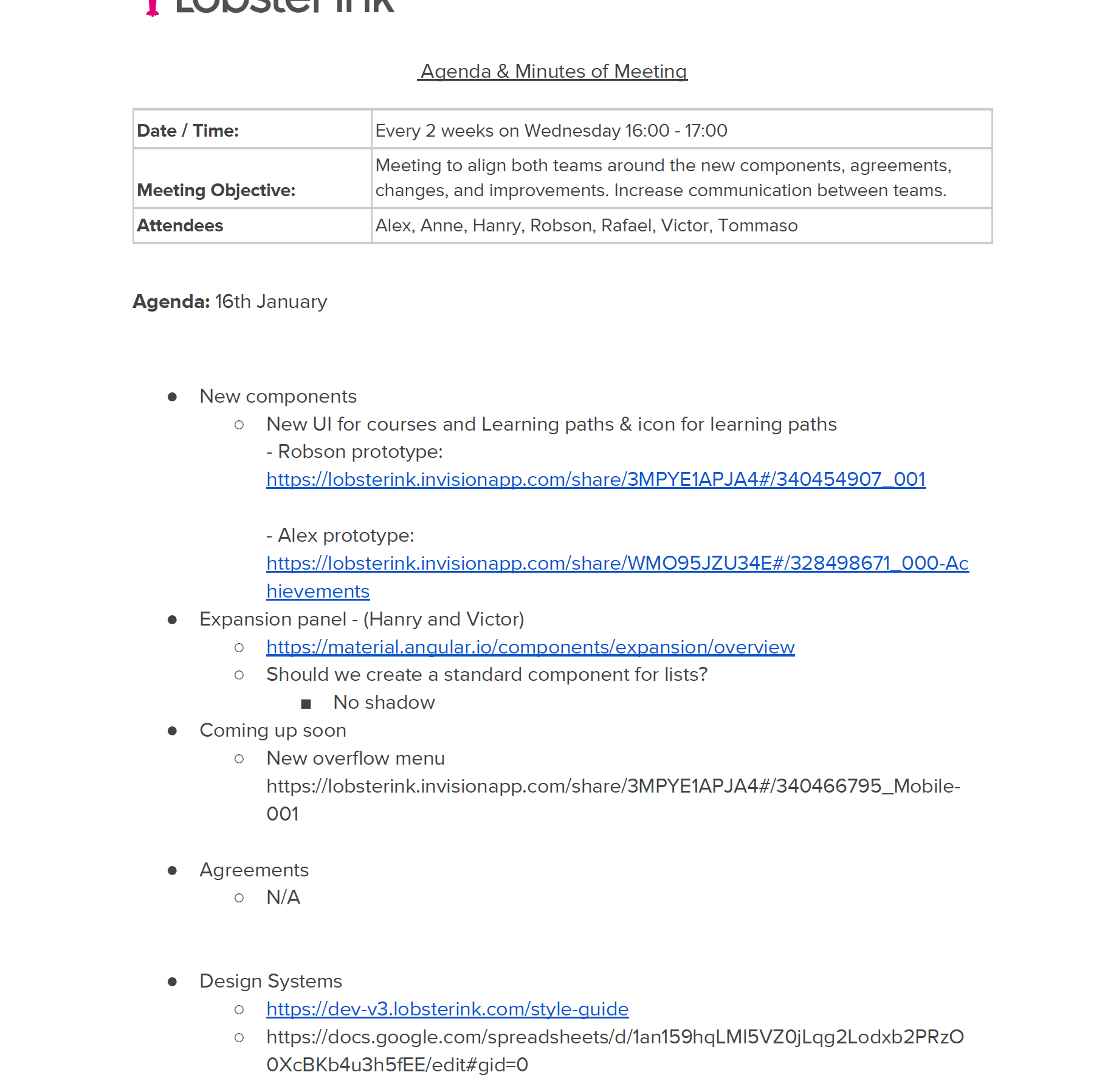
Next, I scheduled a monthly meeting with all front-end developers and designers to discuss not only the design system but also agreements, changes, best practices designing and developing, and so on. These meetings became an excellent opportunity to increase collaboration between designers and developers, who used to have a low level of communication.
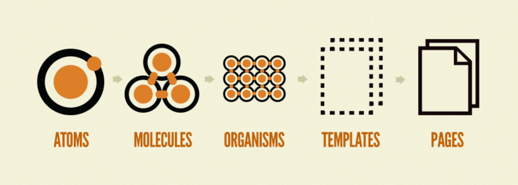
I mapped out all the existent components based on the Atomic Design methodology. The company was already using it in conjunction with Angular Material, so that was the easy part. Also, the design team had a library system inside Sketch, so I could use it as my source of truth to verify the specification of each component.
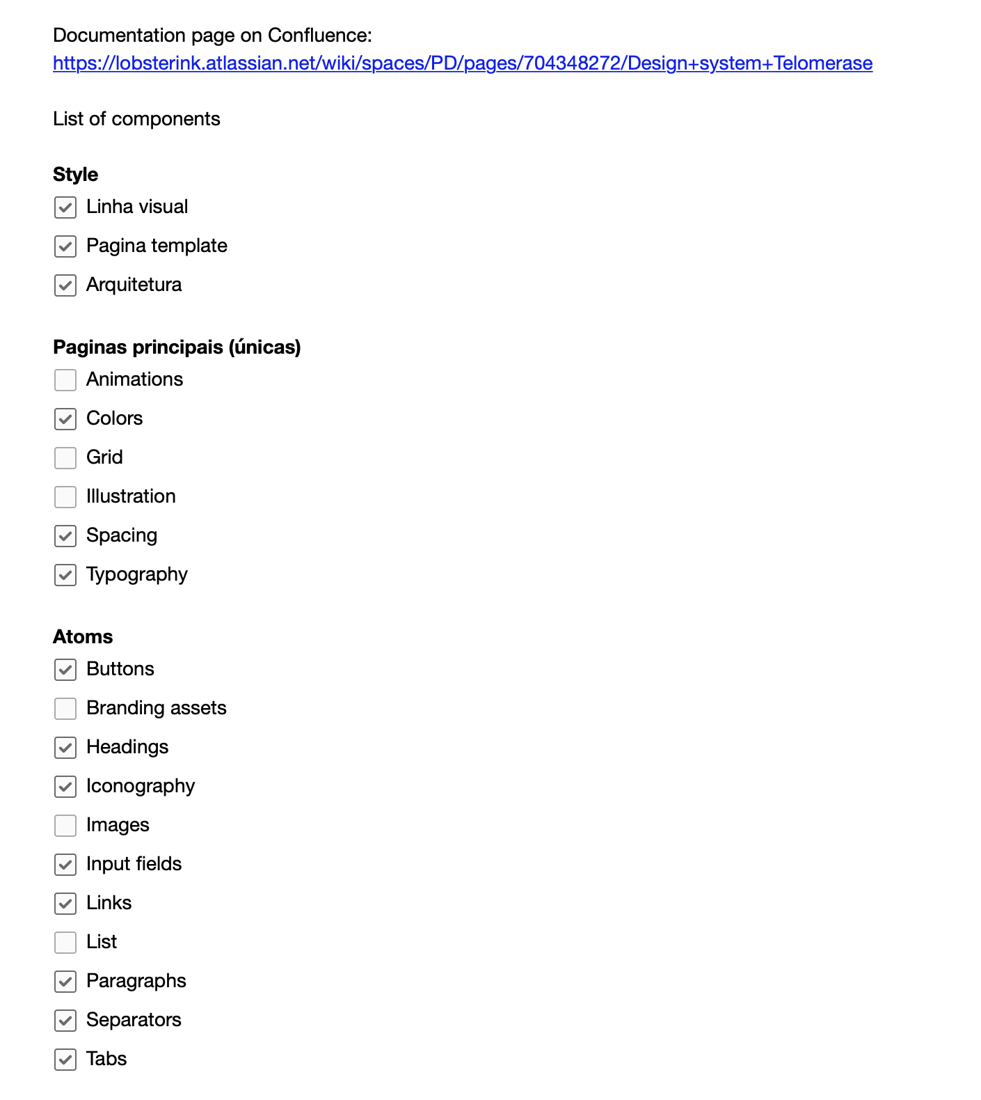
Beyond Angular Material and Atomic Design as a guide when designing and coding, I proposed three core principles to help us make decisions:
Scalability - To avoid code refactoring or components redesign. Code and design solutions have to be thought and built to grow.
Predicability - If someone else has to do some maintenance in your code, it has to be clear on how it works, and how it would be changed. Regarding the UI, the interface must be intuitive and clear to allow users predicting where they have to click or what will happen if they click elsewhere. Let's not reinvent the wheel.
Reusability - Don't repeat yourself, always if possible, reuse components. When you create a new one, make sure that it can be reused.
I have been working on this project for a while now, redesigning, and eventually coding some components. It's an ongoing job where I need to allocate some of my time and be very dynamic, bringing exciting topics to the monthly meetings and also supporting everyone who needs help when using the design system.
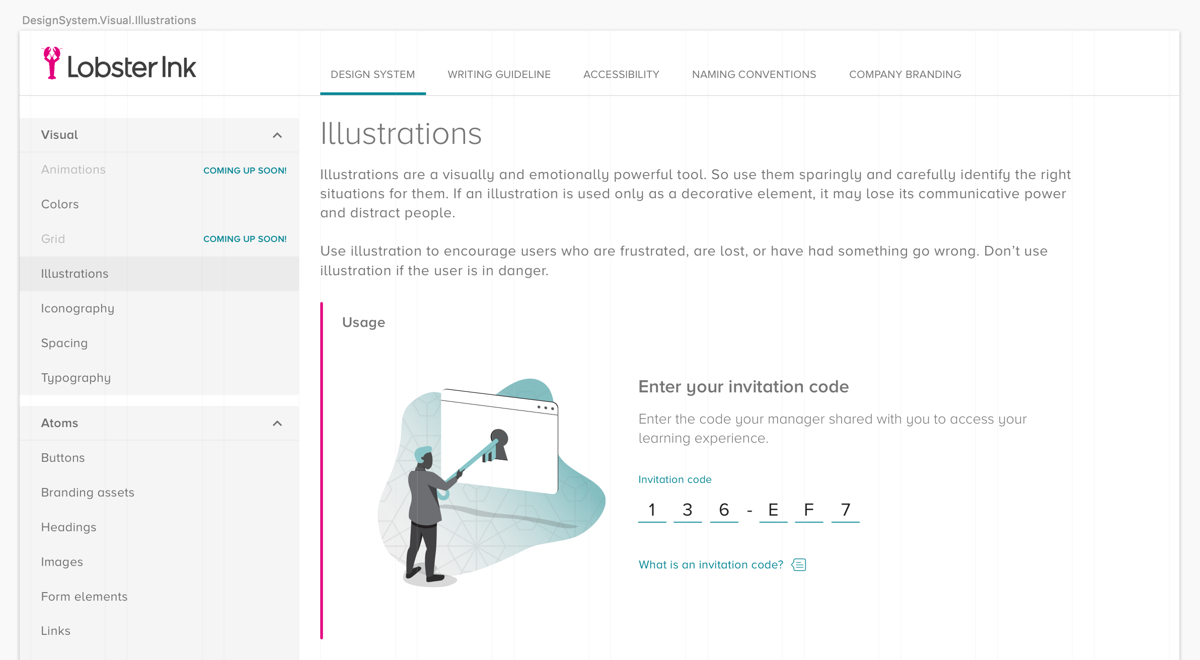
This is an endless project. As the next steps, I want to set up a version control mechanism to decentralize the work, so that all front-end developers and designers will be able to contribute to the project. An expanded version of the project will embrace a few more items, such as accessibility, writing guideline, naming conventions, and branding assets.
