esc
At Lobster Ink - an e-learning company, I currently work in the "Manage team", designing all the administration features for the Learning Management System (LMS). Currently, we are accountable for enabling over 100k managers to train and evaluate thousands of professionals in the hospitality industry around the globe.
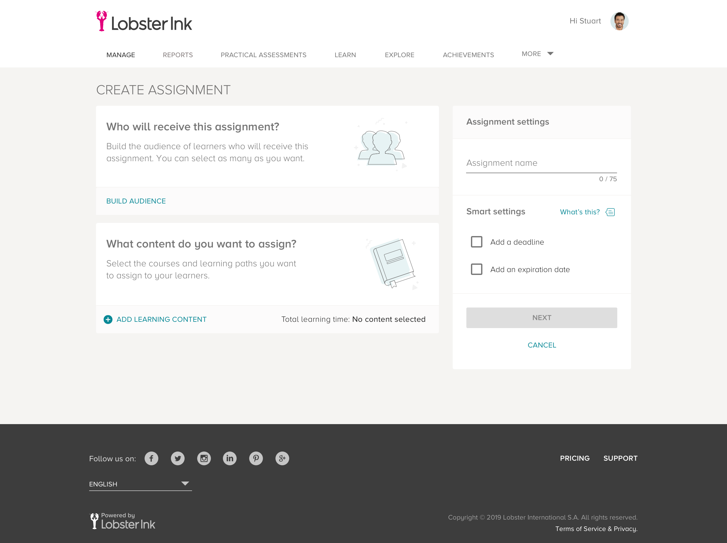
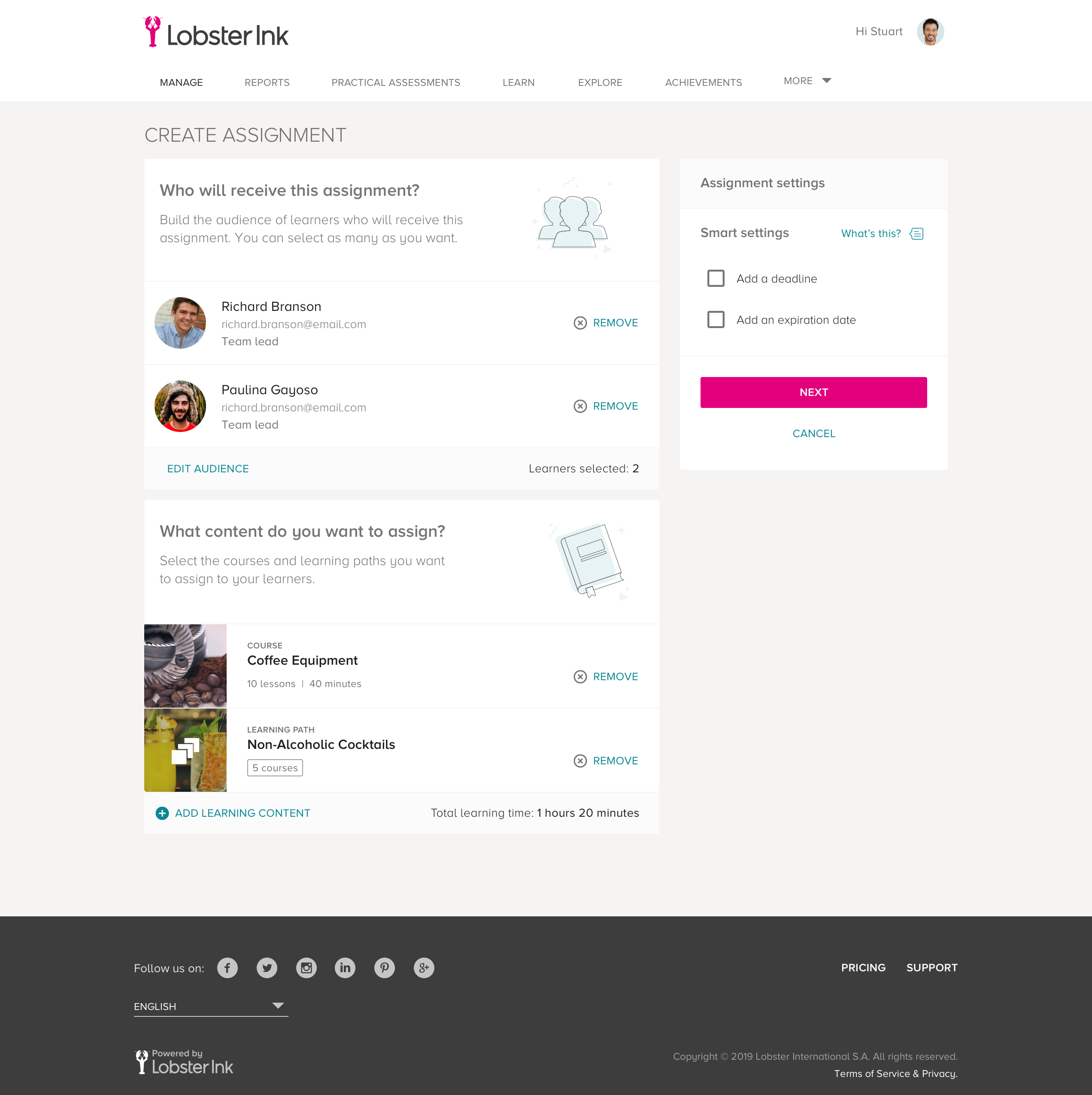
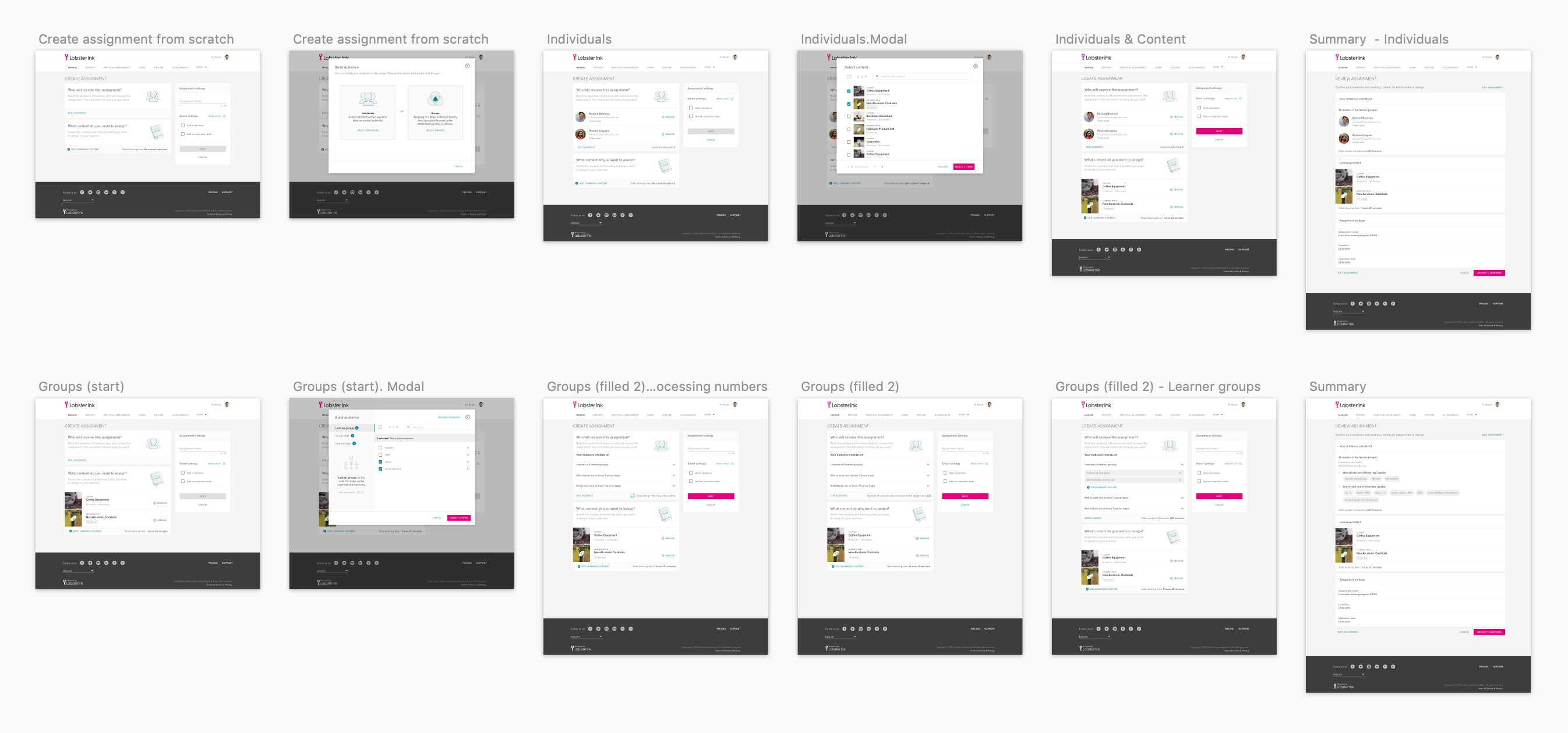
One key feature of an e-learning platform is to create assignments. An assignment is the combination of content (courses or learning paths) + target (individual users or groups of users).
There are currently several ways to create assignments, by different specifications and different flows to go through. However, all these options are expensive to maintain and hard for users to get used to. As a secondary problem, there is also a functionality responsible for filtering the targets, which its logic is not clear enough for the hotel managers.
First things first, let's deep dive into the problem, reviewing user journeys, tech limitations, and rules.
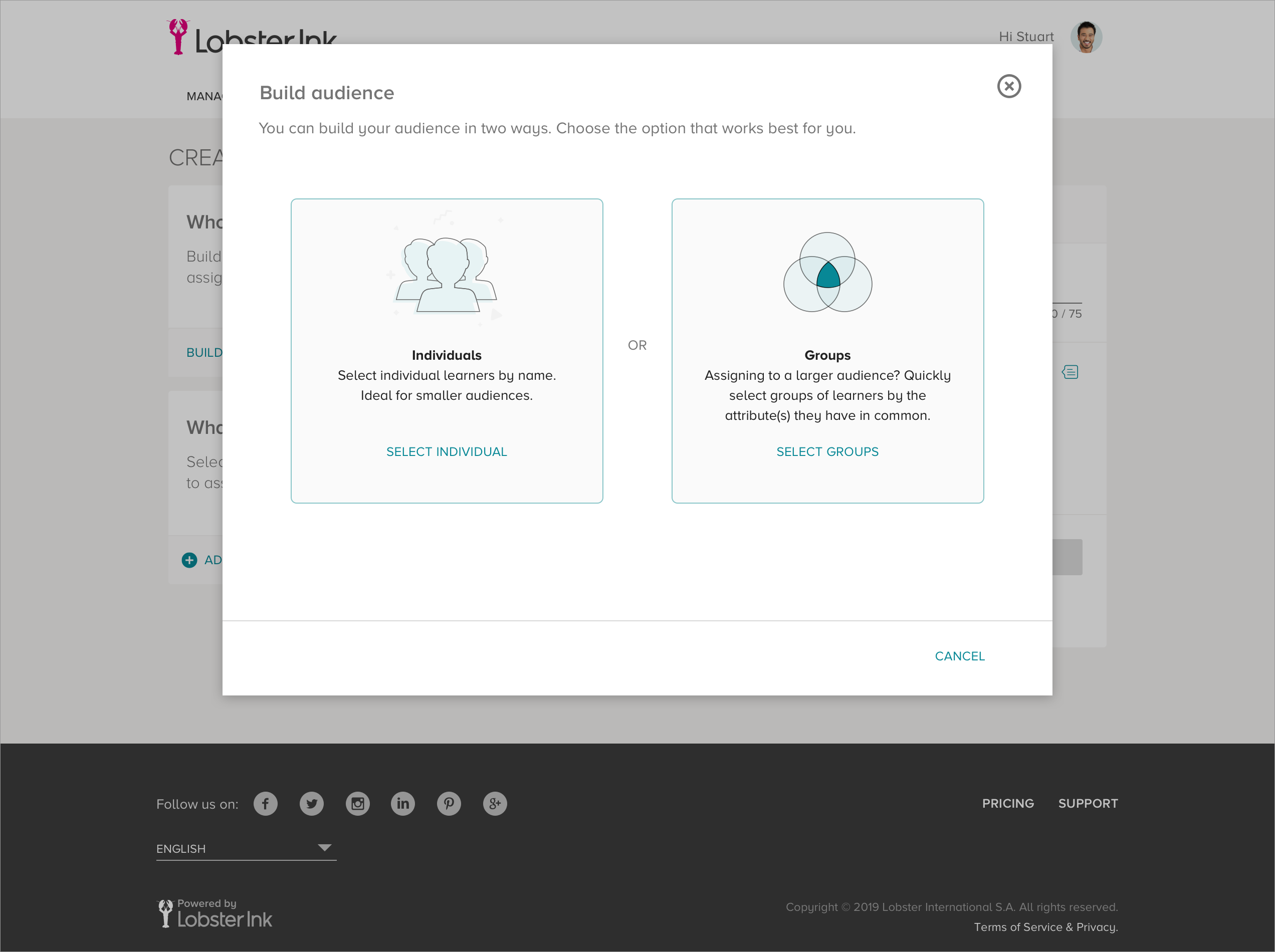
There are two possible scenarios when you assign content. One is assigning content to individuals, and the other one is creating assignments to groups.
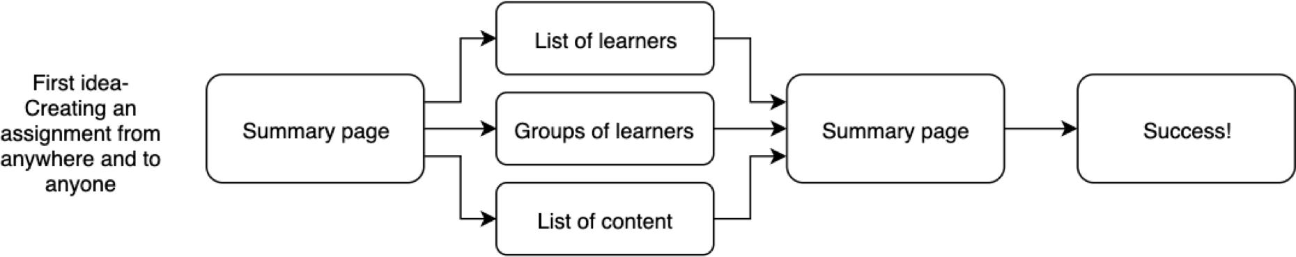
First scenario: There are three possible different user journeys for managers to assign content to INDIVIDUALS.
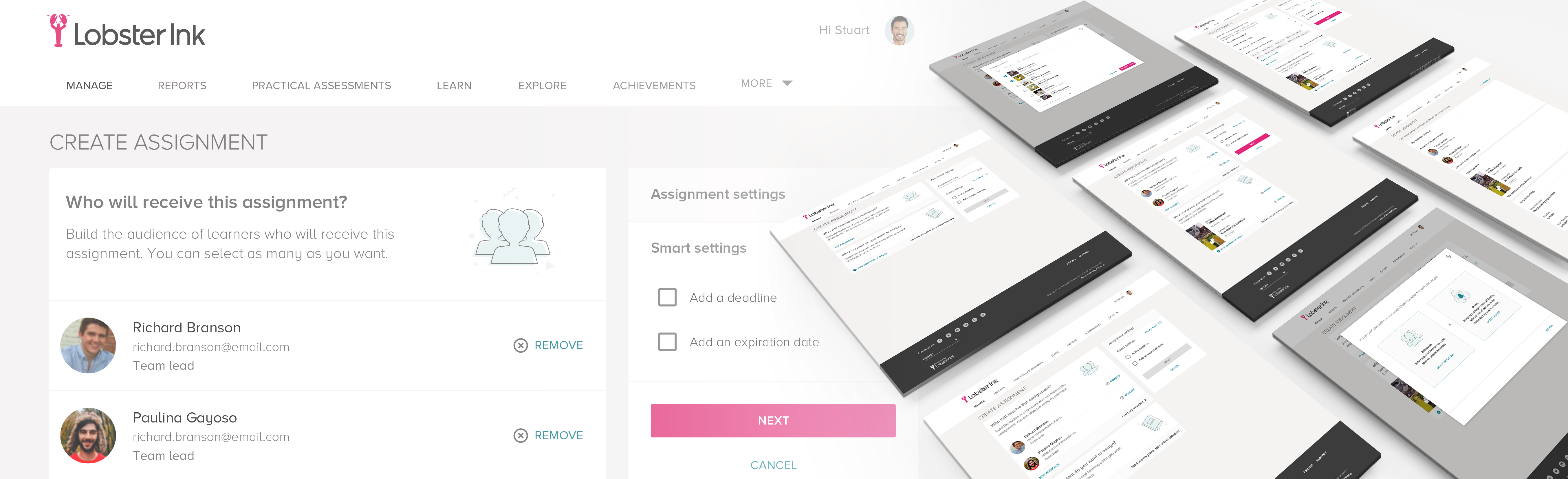
A - Managers open the "Learner Details" page - where they can find the learner's profile - and begin creating the assignment to that specific learner. Then, they go to the next page to select content, after that, there is a "Summary" page where they can review and finally press the button to create the assignment.

B - Managers begin by selecting the content on the "Explore Content" page, then, they go to a list where it is possible to pick up learners they want to assign the content to, and finally get to a "Summary" page as in the flow A.

C - Without accessing the "Learner Details" page (A) or the "Explore Content" page (B), Managers can create the assignment from scratch. After clicking on the "Create Assignment" CTA on the "Home" page or on the "Manage Learners" page, they get to the list of learners, then to the content list, and finally, it will lead them to the "Summary" for reviewing and completing the task.

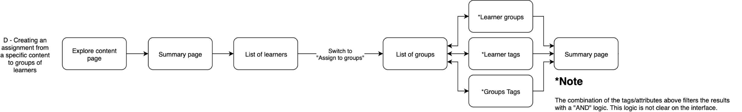
Second scenario: There are two possible flows when assigning to GROUPS:
D - Managers begin choosing the content on the "Explore Content" page, then go to the "Summary" page, where they can choose the option to select learners. On the "List of learners" page, they switch from "Individuals" to "Groups" mode, and they see all the available groups of tags in the workspace; next, they reach the summary page, and finish the task pressing the button "Create the assignment."
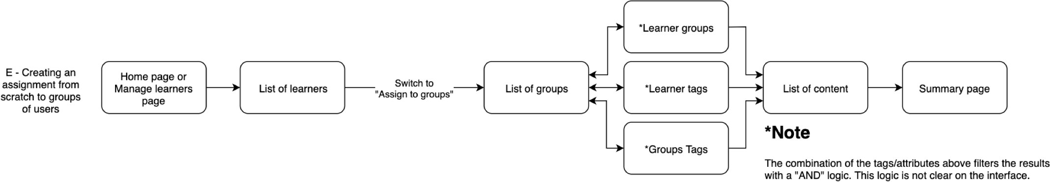
E - Managers start from scratch as in the flow C, however on the "List of Learners" page, they switch to the "Group" mode, where they can choose groups and add tags to filter the learners. Lastly, they select the content, check everything on the "Summary" page, and submit the assignment.
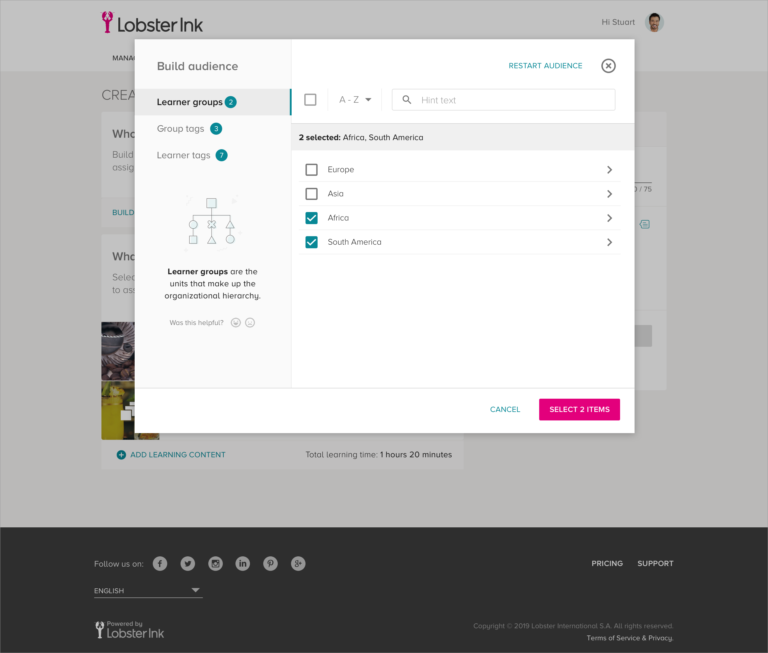
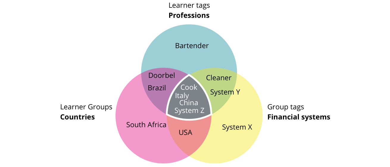
It is essential to understand the tags functionality at this point. They group learner by similar attributes, for example:
- Professions: bartender, cook, doorbell, or systems.
- Finance systems: System X, kitchen System Y, System Z.
- Countries: Brazil, China, Italy, South Africa, USA
When you combine them, you filter specific learners, for instance, all cooks, from Italy or China, who uses the System Z, as exemplified in the picture below:
Researching on Google Analytics to understand what, how, and when managers used each flow, I found out that each client has its own internal processes, which makes it impracticable to prioritize only one flow.
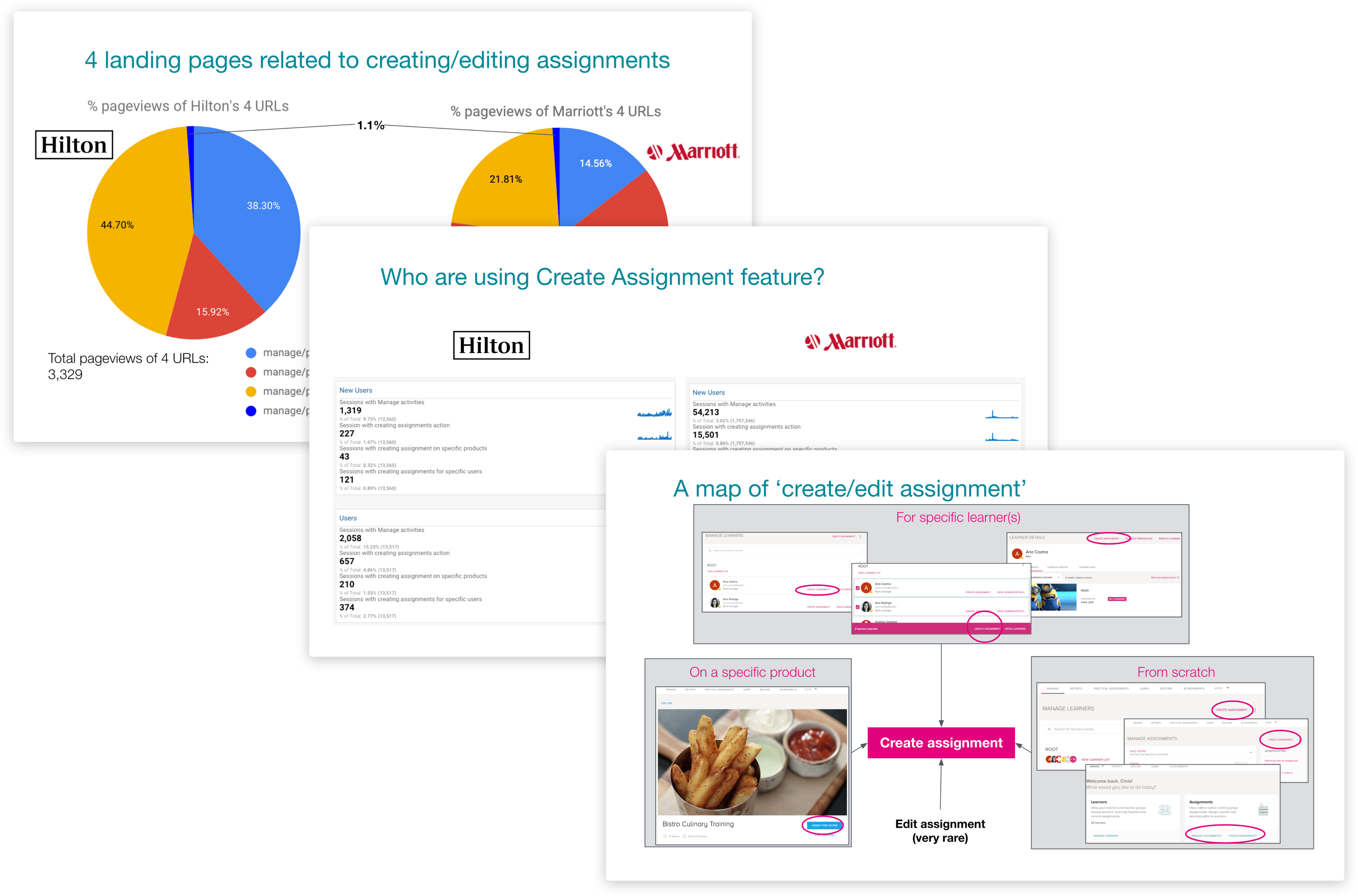
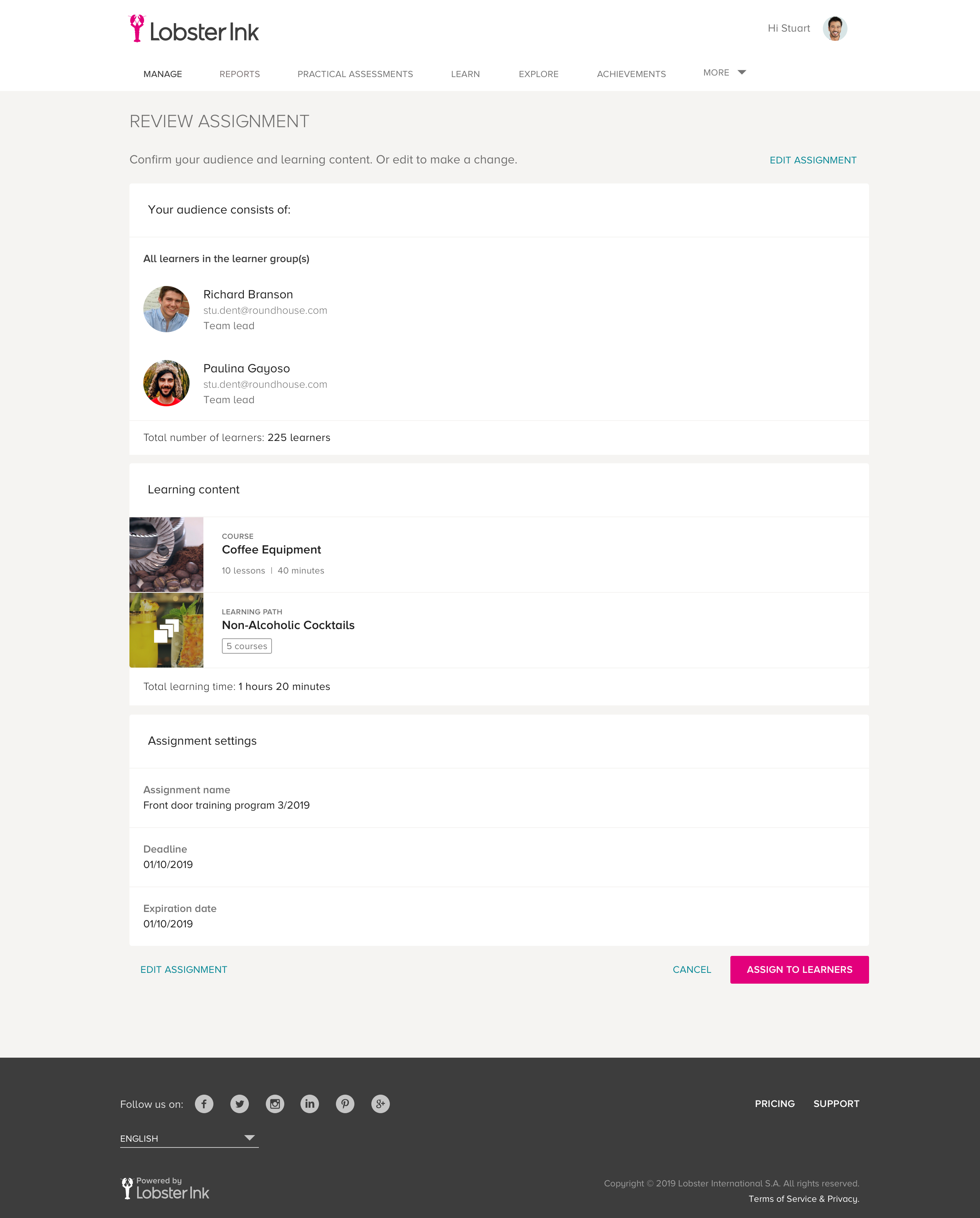
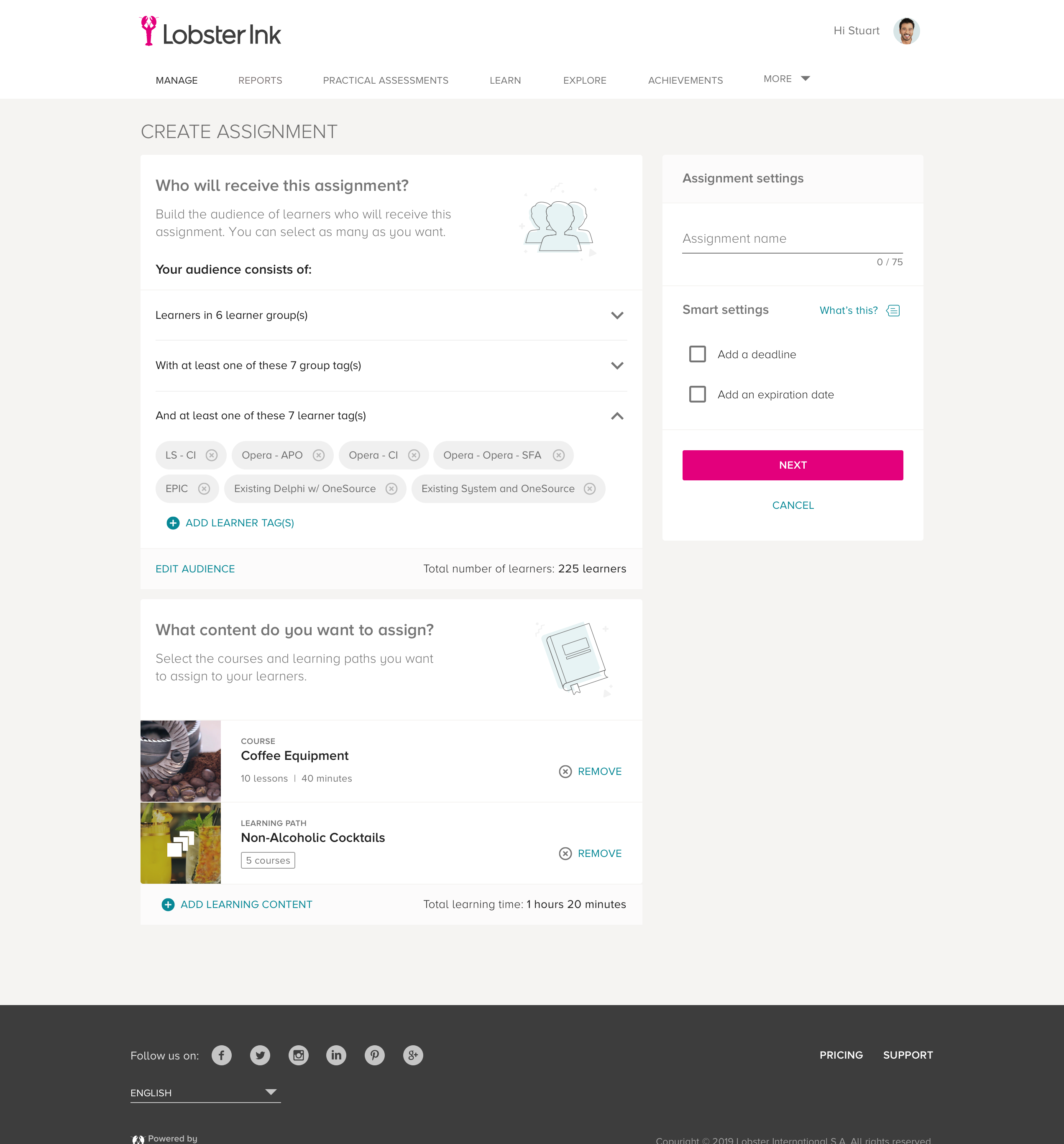
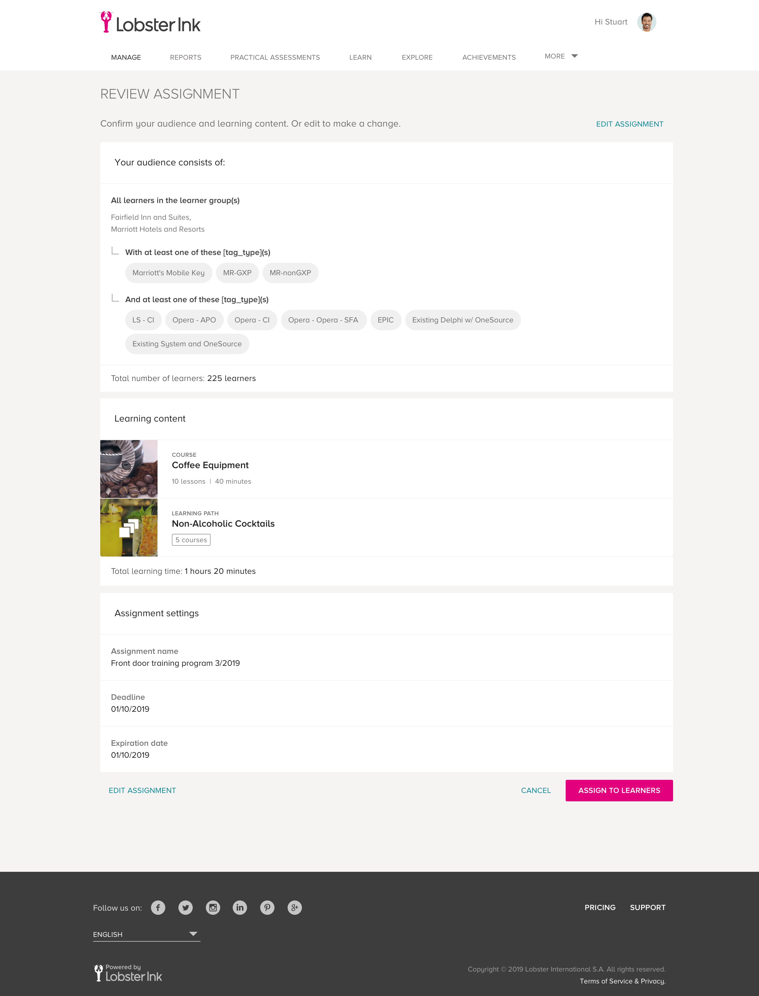
However, one thing caught my attention since the beginning; all flows headed towards the summary page. I reviewed the user journeys and noticed that it was possible to use the summary page as an initial and central page. Wherever managers began creating the assignment, they would see this page first and return there at the end of each step.
I also defined the KPIs at this point, conversion (for completion) and bounce rate would tell me about the acceptance of the new flow, while duration would show me how faster managers were finishing compared to the old version.
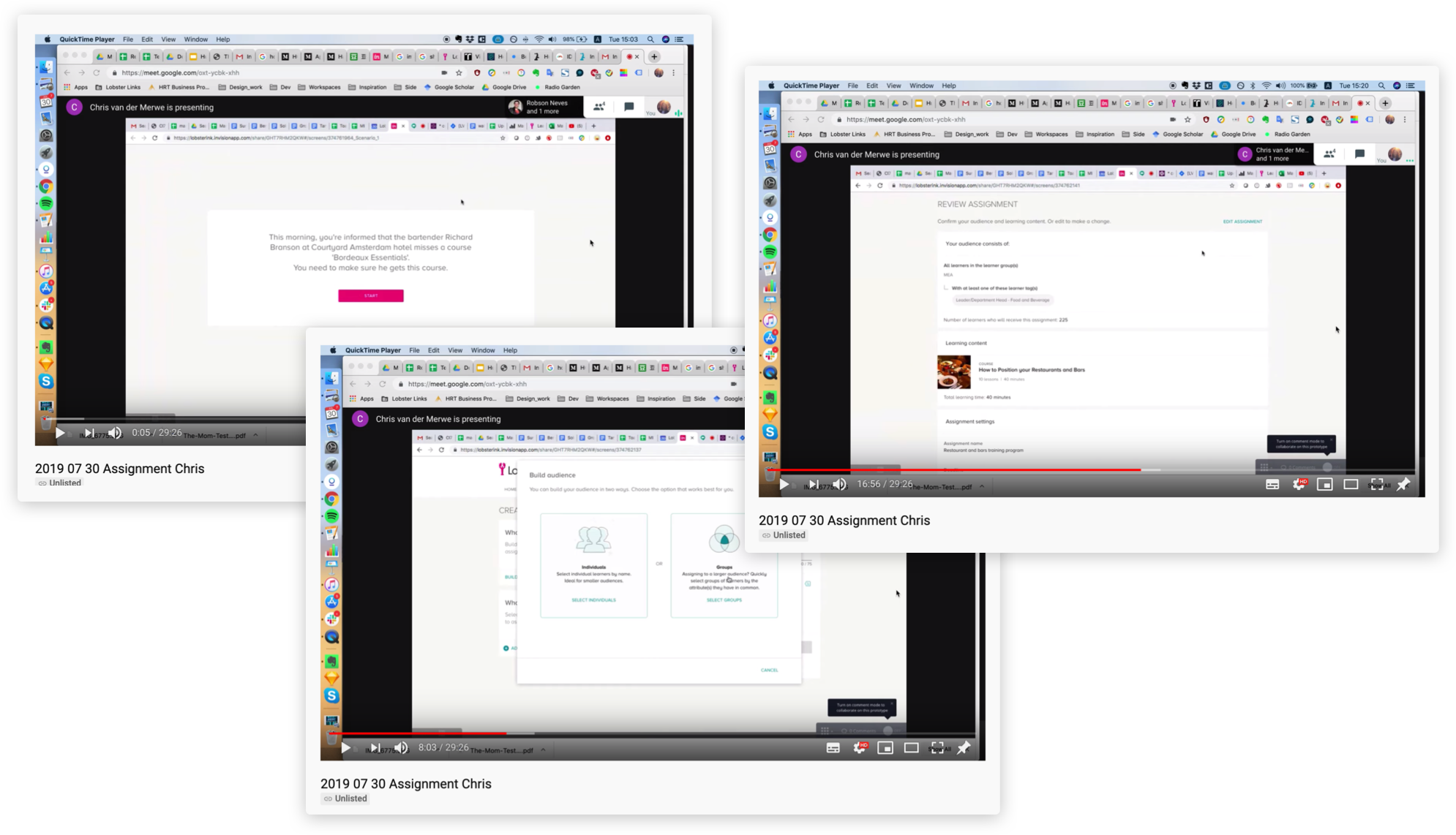
To test the usability of this hypothesis, I prepared some wireframes and ran a few concept tests within the "Implementation" team, who are currently the primary users of this functionality. The tests had gone well; the new flow met everyone's expectations and fitted the user journeys. Although one thing was not good enough: people were struggling to understand how the tag filtering work.
To solve this usability issue, I ran a workshop session with another UX Designer, a PO, a UX Researcher, and a Copywriter. After explaining the context, personas and problem, we did the Four-Step Sketch (Notes, Ideas, Crazy 8's, Solution Sketch), followed by voting using stickers, like a heat map (thank you, Jake Knapp).
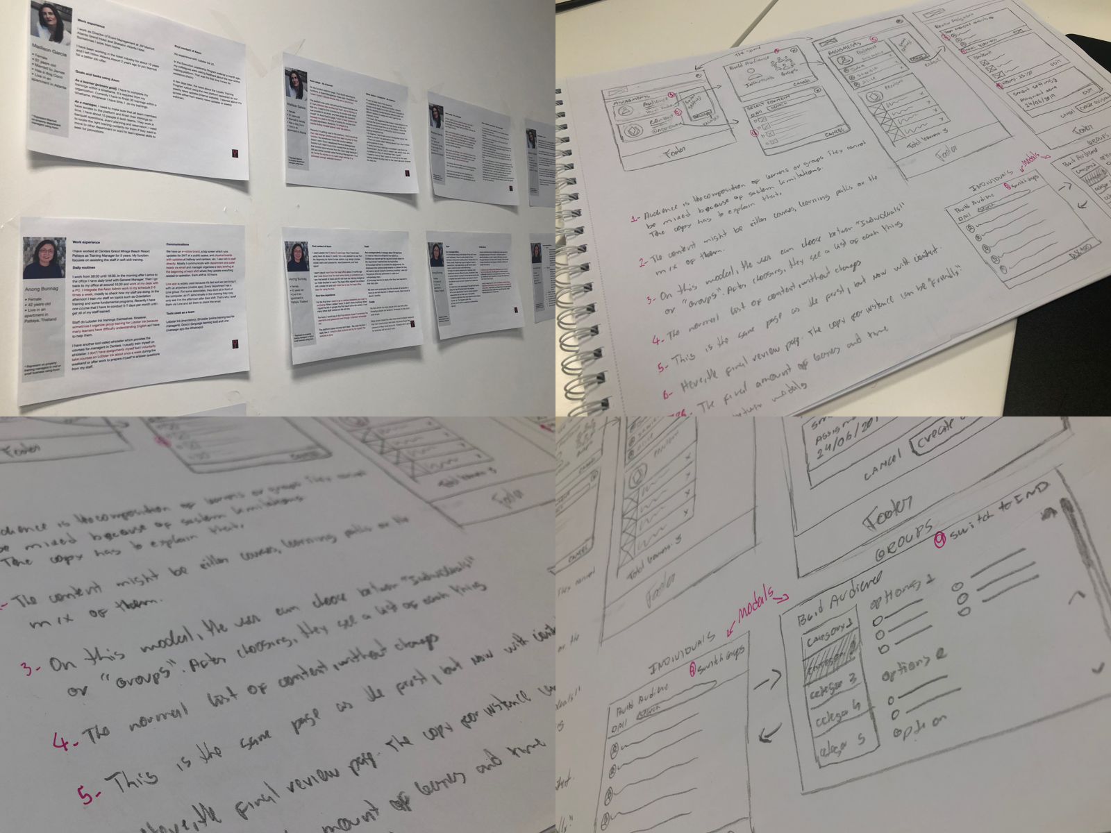
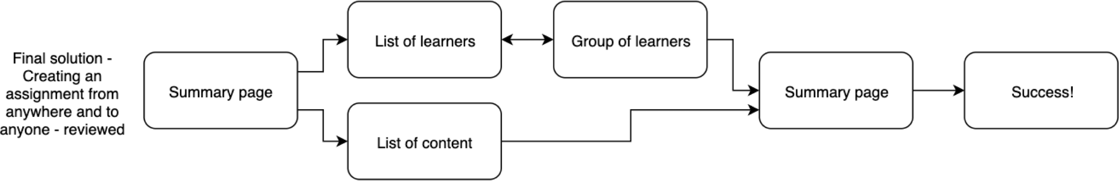
The two most voted ideas were complementary. The first simplified and clarified the selection process by giving a space dedicated to tags (a modal). The second added a verification step later and the total number of learners, reaffirming the impact of the assignment. We also did a small change in the user journey, to create a clear separation of learner and content selection, we set INDIVIDUAL and GROUP selection together in a modal.
Awesome, let's prototype it right?
Not so easy. There was a constraint on the final solution, which we had to first check with some developers. There was no way to get the final number of users instantly. The assignment mechanism used to work like an on-demand service, and you could only know the exact number of learners once everyone got the assignment. After checking with different architects, we realized a POC (proof of concept) could help us. Yes! They had found a way to get the information without running the whole assignment. Now we were good to go.
While I was prototyping, the UX Researcher recruited users for the usability test and wrote the test script. As soon as I finished the prototypes, we reviewed everything together.
Every Monday, we have a "Critiques session" with the design team. This meeting is critical to update everyone about the projects that we are working on, get insights, validate the interface, components, and copy. During these meetings, the entire team was very helpful, supporting me to achieve the final solution.
During the first round of usability tests, we detected a few issues. The tags were not very clear. We added some illustrations and a short explanation of each tag's category and improved the navigation. We ran a second round of tests to make sure about the change's effectiveness and verified that no other usability issues existed.
This project is currently under development. I keep supporting the "Manage team" while working on other projects. It requires a design quality assurance review, to check all interactions, UI aspects, and set up all trackable components on Analytics.
Later on, we will conduct an A/B test, using the KPIs that I've mentioned earlier, to compare a few ambiguous questions we still have at this new version. Currently, we use Google Optimize combined with Google Analitycs and Hotjar to analyze the data and attest to the success of the tasks.
Here you can check some of the final screens: